PuNk'D King's Blog

Wednesday, October 11, 2006

Image Essay # 5


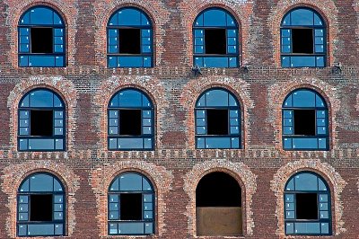
I feel that this image best represents the term Broken Pattern. This image takes a lot of thought and dedication to figure out exactly where the broken pattern is because it has more than one and they’re not all so obvious.
Now I know that right off the bat just about anyone can tell that there is a window missing in the last row and that is where the broken pattern lies and that’s true but that’s not the only place where there is a broken pattern. You need to look at every window very closely in order to pick out every detail and to really notice where the broken pattern becomes extremely complicated.
Look very closely at each window and notice how every little glass pane has a little white sticker on it. Pay very close attention to the size and shape of each sticker because they play a key role in trying to figure out the pattern and they really do complicate things but they also make life interesting.
Notice the bottom-middle pane of each window. The sticker is located in exactly the same spot but are they all exactly the same size in all of them. The same goes for the bottom-left pane. Now I could go on and point out every broken pattern or pattern that there is but I don’t want to spoil all of the surprises that are in store for you!
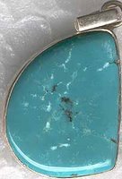
Image Essay # 4

The symbolic color that I have chosen is turquoise. This particular color can mean so much in different civilizations and cultures. It even takes on more of a meaning when it’s inside of a stone.
In general terms turquoise is a symbol of the blue of the sea and the sky. Infinity in the sky speaks of the limitless heights of ascension. The stone is opaque as the earth, yet it lifts the spirit high, laying bare to us the wisdom of both the earth and the sky. When worn in a ring, it is believed to assure a safe journey; worn in the ear it prevents reincarnation as a donkey; appearing in a dream, it is auspicious; when found, it brings the best of luck and gives new life (in contrast, it is not considered lucky to find gold or coral); when changing its color to green, it indicates hepatitis, yet at the same time it draws out jaundice. Most importantly it is believed to absorb sin. Strings of prayer beads too include turquoise. In fact, when worshipping the popular goddess Tara in her green form, because of the color association, it is desirable to do so with a rosary entirely composed of turquoise beads. There also exists as well the concept of living and dead turquoise. Living turquoise has a healthy blue color, whereas dead turquoise has turned either white or black. In the natural aging process of turquoise, exposure to light and body oils darkens the color, eventually turning it black. Tibetans compare this to human aging and death. Wearing "living" turquoise is therefore very desirable, as it will give long life to the wearer.
Turquoise has also been held as a sacred stone by ancient cultures other than the Tibetan. It was sacred in Egypt along with malachite and lapis lazuli. It was also sacred to the Persian culture, where it symbolized purity. American Indians believe it to be a protector and guardian of the body and soul. Gypsies wear this stone in their navels, believing it to be good for everything.

Image Essay # 3


I think that this image represents the monochromatic color system very exquisitely. Just by looking at it you can tell what I’m talking about. The multiple variations of the hues are depicted quite nicely.
First off the most obvious one is the different variations of blue. You can see that light blue, medium blue and dark blue are all represented here. Not only that but notice how one variation blends so nicely into the next one almost like it’s all one color but yet you can obviously see the different variations of the hue.
There is also another very different type of variation occurring that goes along with this theme. That variation involves the color yellow. It starts out as a dark yellow and then works its way up to a medium yellow, this is where things start to get interesting, because from here the yellow gets so bright that it almost looks like pure white but there is a hint of yellow still in it.
Now there is a very diminutive differentiation between the variations of red. This time it doesn’t really show a medium variation but it does however represent the blending of dark red to bright red quite nicely.

Image Essay # 2


This artwork portrays the chromatic value vocabulary word. Well it’s obvious that this painting has a massive amount of value in it to begin with. Every color that is represented in this painting has value to it, some more than others.
Well as you can tell the dark purple or blue in the background would have a higher chromatic value then let’s say the pear that is back there with it. The pear is very dense which really takes away from its value. This in turn doesn’t really make it stand out from the rest of the composition much like the cloth that is wrapped around it. The cloth is definitely trying to show its dominance in every aspect. It’s dominant in size of course but also in value. There’s nothing else that really stands out in high value and the low values don’t differentiate enough. Take for example the apples and the pepper. They’re both done in bright colors and their brightness doesn’t really vary enough so you’re unable to tell which one has more than the other one. I think that it should have more white blended in with the blue or darken up the pepper so you don’t have so much similarity in the piece.

Image Essay # 1

This image can actually be seen as grouping and symmetrical. This image is actually an optical illusion and I haven’t seen too many optical illusions use Gestalt’s Principles. That is why I chose this image and why I think that it is the best to represent this principle. When using or identifying the grouping principle your brain tries to find mental patterns by forming a connection between the elements of sensory contribution.
In this image you can make the connection of grouping by several ways. One way would be by the size of the two faces. You can tell that they are exactly the same size and that they look exactly alike so therefore you can conclude that they are grouped together for a reason. This also closely relates to the symbols that we just got done creating. Our symbols needed to be symmetrical which this is and it does portray a meaning and to help with that meaning we incorporated the principles. Which by this piece we can conclude many things but I perceive it as two heads coming together to come up with one grand idea. You can also relate this to grouping by its shape. The two faces are identically proportionate with each other so therefore you can conclude that they’re grouping served a purpose. The artist wanted you to look beyond the ordinary so that you can see the extraordinary.

Blog Entry # 3

  1. Before this Blog Assignment, had you ever kept a journal, diary, or blog? Yes
  2. Before this Blog Assignment, had you ever written about art before? A few times
  3. Have you ever written for fun (poetry, fiction or non, journalistic, or research)? Often
  4. When writing, do you use a dictionary or thesaurus? Both
  5. If given a chance, would you rather discuss art verbally or through written means? Written
  6. How would you rate your overall vocabulary? Above Average
  7. How would you rate your vocabulary of art terminology? Average
  8. How would you rate your writing abilities? Confident
  9. How would you rate your writing abilities when writing about art? Average
  10. How would you rate your ability to use specific vocabulary when writing? Average