Blog Entry # 5


 The artist that I chose is Chip Kidd.
How has this artist contributed to the field of study which you plan to enter?
This artist has done so much and he really knows how to design things so they look almost perfect and quite inspiring. He is very well known for his book jacket covers and poster designs. All of his book covers are simply amazing and you can really see the detail that he put into them.
What achievements or developments makes this person stand out in that field?
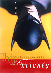
Regarded as the world's foremost book jacket designer, Chip Kidd's work covers a wide array of authors: Michael Crichton, Allan Gurganus, Anne Rice, and John Updike, to name only a few. In his 14 years at Alfred A. Knopf, the venerable New York publishing house, Kidd has created more than 1,500 book jacket designs. His always imaginative and often daring design work has, according to Graphic Design: America Two, "helped spawn a revolution in the art of American book packaging in the last ten years."
What impressed you most about this artist?
I was most impressed how his work really stands out and how his use of color really brings out the meaning of a picture. He is able to use the value contrasts/ scale to his advantage to make some awe inspiring pieces. He’s not limited in his work either. I mean it’s not like he only does famous comic book characters because he is able to create some original characters and they aren’t always happy pieces some are darker.
How have they used dominance to organize or structure their work?
He uses dominance to show importance in all of his works. Like for instance in the Retro Romance piece he makes the woman’s head bigger and completely positioned in the piece when he has the man’s head almost all the way off of the edge. It looks like he’s trying to say that the romance is stronger and more important to the woman than the man.
How do they address the human form?
Well it looks like to me that he can address it in many different ways depending on what the piece calls for. He can address it as a comic book character if needed or he can add some realistic features to it if it’s supposed to be about real live human beings. One thing that is common though is his details in the face to make them actually look like real faces no matter what. His use of shadowing to really bring out certain features is simply magnificent.
In what ways have you been influenced after seeing their work?
I would say that I’ve been truly influenced by his work and it makes me want to improve my craft that much more. I want nothing else than to create my own pieces like these some days and I would love to use the techniques that he uses to make my just that much more greater. I can truly say that he makes me want to become more creative in every piece that I will ever make.
How does this artist use color? What color schemes or other mechanisms, such as emphasis or temperature, do they employ?
He uses color to accentuate certain attributes on the characters to really make them stand out. He really tries to stay with one color scheme for the majority of his art pieces. He uses the different variations in colors to his advantage, sometimes just to bring a character out of the background and into your faces. He definitely employs temperature for sure because in his clichés pieces he really gives Superman a warm and powerful feeling while on the other hand he gives Batman a sort of dark and mysterious feeling to represent who they truly are.
posted by Wildstallion22 at
11:43 PM
![]()
![]()


0 Comments:
Post a Comment
<< Home