PuNk'D King's Blog

Friday, December 08, 2006

Blog Entry # 5


The artist that I chose is Chip Kidd.
How has this artist contributed to the field of study which you plan to enter?
This artist has done so much and he really knows how to design things so they look almost perfect and quite inspiring. He is very well known for his book jacket covers and poster designs. All of his book covers are simply amazing and you can really see the detail that he put into them.

What achievements or developments makes this person stand out in that field?
Regarded as the world's foremost book jacket designer, Chip Kidd's work covers a wide array of authors: Michael Crichton, Allan Gurganus, Anne Rice, and John Updike, to name only a few. In his 14 years at Alfred A. Knopf, the venerable New York publishing house, Kidd has created more than 1,500 book jacket designs. His always imaginative and often daring design work has, according to Graphic Design: America Two, "helped spawn a revolution in the art of American book packaging in the last ten years."

What impressed you most about this artist?
I was most impressed how his work really stands out and how his use of color really brings out the meaning of a picture. He is able to use the value contrasts/ scale to his advantage to make some awe inspiring pieces. He’s not limited in his work either. I mean it’s not like he only does famous comic book characters because he is able to create some original characters and they aren’t always happy pieces some are darker.

How have they used dominance to organize or structure their work?
He uses dominance to show importance in all of his works. Like for instance in the Retro Romance piece he makes the woman’s head bigger and completely positioned in the piece when he has the man’s head almost all the way off of the edge. It looks like he’s trying to say that the romance is stronger and more important to the woman than the man.

How do they address the human form?
Well it looks like to me that he can address it in many different ways depending on what the piece calls for. He can address it as a comic book character if needed or he can add some realistic features to it if it’s supposed to be about real live human beings. One thing that is common though is his details in the face to make them actually look like real faces no matter what. His use of shadowing to really bring out certain features is simply magnificent.

In what ways have you been influenced after seeing their work?
I would say that I’ve been truly influenced by his work and it makes me want to improve my craft that much more. I want nothing else than to create my own pieces like these some days and I would love to use the techniques that he uses to make my just that much more greater. I can truly say that he makes me want to become more creative in every piece that I will ever make.

How does this artist use color? What color schemes or other mechanisms, such as emphasis or temperature, do they employ?
He uses color to accentuate certain attributes on the characters to really make them stand out. He really tries to stay with one color scheme for the majority of his art pieces. He uses the different variations in colors to his advantage, sometimes just to bring a character out of the background and into your faces. He definitely employs temperature for sure because in his clichés pieces he really gives Superman a warm and powerful feeling while on the other hand he gives Batman a sort of dark and mysterious feeling to represent who they truly are.

Image Essay # 15

One of my favorite ways to design something is by orientation. The orientation of the objects can pretty much make or break your piece. You have to watch how you arrange everything because you do not want to take anything way from the meaning or the symbolism of the piece. In this piece the orientation is everything pretty much. Just look at how everything is done with precision. When arranging objects in an art piece it is very crucial that you are very precise in every little detail. You need to have everything looking just the right way or else your composition will get messed up and you will fail in creating a great piece of art. This piece has every angle covered. He has everything either positioned horizontally, vertically, or diagonally and each choice he chose enhanced the design element. The way everything is arranged really gives the piece a flowing motion to it almost like you are actually going to walk down the path and see all of these three dimensional elements. With the way he positioned the path and the computer monitor it almost looks like you enter this world through there and all of your troubles will just fly away.

Image Essay # 14

This picture is the perfect example of variety. Whenever you go to the store you always see a massive amount of variety in all the products especially the produce. Everyone has different tastes and this picture can account for that. In this picture you have at least one of everything and it shows what kind of textures each of them have. This group is very diverse and each piece of produce has their own qualities that they bring to the table. We all know that different foods provide us with the different needs in order to survive. This group is very distinguished from other groups in the aspect that these have a lot darker colors and different characteristics. Look at the variety in colors and how well the mesh together to make this photograph look spectacular. Only when you have a good variety of objects can you accomplish this. When we have a variety of things to choose from our eyes are trained to find our favorites and we are prone to choose that one but sometimes our mind can play tricks on us because how the objects were arranged. We have to have variety in our lives or else we will just get bored and we would never do anything.

Image Essay # 13

This image in particular is very confusing when you first take a look at it but if you look closely you can see the multiple textures that it has. By first glance it is almost impossible to notice all of the different textures that it incorporates. Look closely and you can see the smoothness on the mounds that almost look like hills. It gives you the sense that you are just floating in the wind while walking in a meadow. In another way it can also look like mountains too just by the conflicting textures that were used. This is supposed to represent all of the multiple terrains that may inhabit a single area anywhere in the world. You can also see the different depths in the land a lot better when you add the texture otherwise it would just look like one solid object. With this birds eye view you can really see the cast of the land and how everything interacts with one another. You could almost say that the texture shows how much tension there really is between the land masses. When adding texture to a piece you can change the meaning entirely and that is exactly what happened here.

Image Essay # 12

The image in this piece of artwork shows how true unity is in the eye of the beholder. When looking at this piece you immediately see the resemblance of a helix or chromosomes. So it is almost like symbolism because when you see an image like this you see the human body and how everything in it has unity. When the chromosomes come together to make one they are showing us what kind of unity we need to have in our lives to survive. We have like forty some chromosomes in our chemical makeup and they all have to function as a unit in order for us to grow and live our lives like they are intended to. It also represents how we as humans try to show unity by making friends and trying new things. We learn unity through our experiences and the people we meet. Ever since we were young we have been told that life is all about unity because we are not alone in this huge world. We need to rely on each other to survive much like the chromosomes need to rely on each other to do the same thing. In the end every successful unit is held together by a strong core much like the yellow spheres in the piece.

Image Essay # 11

The images in this piece of artwork were juxtaposed very nicely. It is trying to show a comparison between the two female forms whether they are the same person or not. When they are put at these particular angles it makes you wonder what the artist is trying to show here. I think that the color mask that he put over everything really helps this piece because it shows like a calm friendship that these two are having. He’s trying to show the positive aspects of some or all relationships by showing these two figures next to each other like this. When you show two images next to each other like this and their eyes are facing each other you can only wondering what they are thinking about the other one. It really makes you wonder what kind of relationship both of this people have with each other. Is it a loving one or a hating one? You can tell that by the color mask that he put on over the two female figures. It could also be seen as a competitive relationship almost like each one is trying to one up the other one because they aren’t directly face to face.

Image Essay # 10

I feel that this image best represents tension in the manner that there is a lot going on. In this unique piece there is a different kind of tension going on. There is actually a positive tension happening in this piece. I think that it is positive because there isn’t any chaos happening in it but the colors due blend together but not perfectly. You can notice that there is a subtle transfer between each layer of color and that they don’t really interact with each other but never the less they are touching and it doesn’t make you feel angry. Usually when you think of tension you think of something having pressured applied to it in order to cause it harm but experience has taught us that that is not always true. Especially when a male and a female come together there is always tension there but in this case it is good tension just like when the object pierces through the light area. There is also a subtle tension between the color values on the object. The edge lines really play off the tension role very nicely because you can see the differentiation in the layers but they never get blurry like if it was bad tension.

Image Essay # 9


This is an actual photograph of a catacomb and you can see that its true beauty is in its definition. I feel that this image has an extremely good sense of definition because of the bricks on the walls and ceiling. You can clearly see where each on of them end and where each one of them begin. You can follow one line of bricks and see how the line definition decreases as you get farther into the catacomb. In the foreground you can see the clearly defined shapes in the bricks advance but as you go back farther into the background you can see the defined shapes start to recede and get extremely blurry. You can also see how the bolder lines advance while the thinner lines recede as well. The clear definition is represented on the catacomb’s floor because as you travel down the pathway you begin to lose light and everything that you were once looking at starts to get blurry. You will notice that even the most defined lines start to get so minute that you will never be able to see them again until it is time for you to leave but even then those lines will never look the same to you again.

Image Essay # 8

I feel that this image has a really good value pattern and it is pleasing to the eyes. This image shows the true aspects of the land and how much depth one landscape can have and how well we can paint a representation of it. There is a significant amount of variation used and it really brings out the warm feeling that you would have if you were there just by the colors chosen. Just look at how well the color differentiates from light to dark especially when he incorporates a light source. Sometimes he makes subtle changes between the variations and sometimes he makes truly dramatic changes. His color variations really seem to flow together real nicely and he makes it so that you can tell when there is a landscape change and you don’t even have to strain your eyes. Even though you get the feeling that this is a very mellow piece he does manage to create some tension in it by the way he makes a rough blend between the trees and the mountainous region. With the colors that he is using he ends up making the foreground’s details lack a little bit but he makes up for it in the middle ground because that is where he wants the main focus of attention to be with his lightly painted house.

Image Essay # 7


This image is a prime representation of Gothic because it shows the true darkness that we all possess and some choose to let it out sometimes. Goth is more than just dressing up in dark clothing or worshiping Satan, it is a way of life and not everyone understands it. Some Gothic people believe that they are a symbol of immortality almost like they are a real life vampire or something. I am one of those people but even though I don’t understand the lifestyle I do respect them for having individuality and not being afraid to show it. When looking at this piece you see the term Gothic as more than just a lifestyle it’s a way to color art. Just by the use of blacks and whites and different combinations of both you get the feeling that you are in a dark place with no light source at all. I t makes you think that you are in a dark, dreary place and that you should be afraid because there is no telling what may be down there. This image is a narrative about a dramatic scene in which you get the sense that they are involved in something that can be seen as immoral but yet they are doing it tastefully. Just by looking at it I get a feel that you can see some of the movie “Underworld’s” imagery in it.

Image Essay # 6


This image is a prime representation of allegory because it shows the true symbolism of immortality. Everything is represented here that we know as mythological beings and that they never die. Mythological creatures have been around for centuries because they stay alive in stories. The details in the figures alone show so much as far as the aging process and no matter how old they get they never die. This image represents so many narratives that we have been told over the years and this is the perfect way to symbolize everything that they mean to us and what they will mean to us. This really speaks to the abstract idea of never dieing and the colors that are used really show that representation very well. The colors give the images hope and something to live for and they show us how life could be if we do everything right and your spirit will never truly die. Each character represents a principle that we all possess or that we wished we possessed and how we use them to our advantage. This image really represents a narrative but it also represents a dramatic scene in which you get the sense that there are a lot of bad things are going on and that they don’t have any morals.

Blog Entry #4

1. Do we define a place or does a place define us? The place defines us because we become a part of it.

2. How is each of the featured artists influenced by particular places? How is this influence reflected in the artist’s work? Richard Serra lets the natural elements spark interest into his pieces. Nature helps with his designs. Sally Mann has a deep connection with the South. She looks at everything as art and just takes pictures of everyday life in the South. Margaret Kilgallon and Barry McGee are all about the street life. He loves to do graffiti art out on the streets where everyone can see them. She is all about billboard art which is the highest form of art that you can see. Pepon Osario is more interested in Installation Works and Home Visits type of art. He gets his inspiration from different memories of his life. His surroundings will help him create a piece like for instance the barbershop scene was based off his memories of the barbershop and the barbershop environment.

3. How has the program altered your notion of how art expresses place? It has definitely given me the impression that art is all around us and we just have to be able to see it and appreciate it.

4. Which artist do you feel most connected to and why? I would have to say that I feel more connected with Sally Mann. I say this because we have similar views about family and I really enjoy Landscape Pictures. I’m just like her in the aspect that I too am able to have a sense of beauty in what surrounds us.

5. Compare the media used by each artist and discuss how it affects the scale, composition and accessibility of his or her work. Richard Serra’s work is all done with huge pieces of metal and as far as scale wise it doesn’t really get affected because he can make big pieces of artwork. I just feel that his composition will be lacking because he won’t be able to include much detail in them. The accessibility could be greater if more people had the means to go see them. Sally Mann takes pictures so she can only make them so big without hurting the desired effect. She can do a lot with the composition but it still can be limited because she’s unable to show a lot of fine detail. Anyone can see her work so that works in favor of accessibility. Margaret Kilgallon and Barry McGee’s accessibility is very good because just about everyone can see the work whether on billboards or on street walls. I feel that there scale is pretty bad because they can only make their pieces of art as big as their canvas. Pepon Osario’s work is mainly creating works of art in the 3-D Realm so his scale will lack tremendously. His composition however could be limitless because there are so many elements that he can work with to create his designs. The accessibility on the other hand has some flaws. Like for instance that most of his work is done in an art gallery or an art gallery type setting that not everyone would have access to.

When you were young, was there a place that interested you? A place that scared you? List five places from your childhood. Use one word to describe each of them.
The Hospital – Terrifying
Grandma’s House – Warm
The Cemetery – Horrifying
Neighbor’s House – Excitement
School - Passion

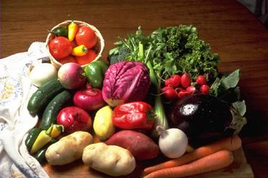
Pick one of those places. Try and remember it as well as you can. Answer these questions about it… What objects occupy that place? What are the textures and sizes of those objects? What was the lighting like? Was it a dark dreary place? Or a bright happy one?

Grandma’s House
o Backyard – grass, huge square
o Fence – wood, metal, huge square
o Shed – wood, siding, shingles, medium cube
o Fountain – water, ceramic, small circle
o Trees – grooved wood, smooth leaves, very tall
o Bushes – rough small leaves, small spheres
o Spoon Collectibles – smooth metal surfaces, rigid edges, small
o Tea Kettle Collectibles – smooth ceramics, soft touch, fragile, small to big
o Display Cabinets – silky glass, soft wood, rigid wood, fits half the kitchen
o Multiple Rooms – wooden floors and walls, silky and dimply paint, huge

The lighting inside was created by a misty, fluorescent light fixtures. The lighting outside was natural and created by the sunshine with some shadows.

No matter where you are at in or outside grandma’s house it is always a bright happy place and a wonderful time.

What are the important stories that are told in our society today — in books, movies, pictures, music, the news, or by friends and family? Consider — if you could personally guarantee a single story to be passed down to future generations — what would that story be, what form would it take, and why?

Books: Well the basic stories that we’re told as kids are Fairy Tales. When we get older they turn into Urban Legends.

Movies: There are some common themes in movies such as: True love conquers all, Serendipity or Faith, Poor to Rich and many others.

Everything else pretty much tells the story about life and how events affect our lives.

The one story that would be guaranteed to be told in the future is the whole 9/11 event and the aftermath of it. This story would take the form of books and stories that families tell from generation to generation. It would take those forms because they would be able to carry the true meaning of the event through the years and everyone will add their own experiences to it without sounding redundant.

Why are some stories told, as opposed to others? Why do some stories continue to be told over time while others are lost?

Some stories are meant to be memorable and some are just meant to pass the time. The ones that are told over time are the ones that have true meaning to them and they aren’t just fictional matters that were just made up to explain something.

How do the artists featured in Stories use journals or sketchbooks in their artistic processes? Is a journal or sketchbook a work of art? Why or why not?

They use them to help find the story behind the art that they’re trying to create. It helps them to provoke and inspire them which in turn make good art. Yes they are considered works of art because there are different kinds of art and anything that is created even in a sketchbook or a journal can be considered a work of art.

Each artist in this hour describes an event or element in his or her childhood that resonates in current work. Do you remember a time when you were 5, 10, or 15 years younger. Please record, in a present-tense voice, the experiences that were important at that time. How did you spend your days? What did you dream about? What emotions did you feel? Write a self-description in your childhood voice, followed by a second description of yourself at that age from the point of view you have now.

I was fortunate enough to experience important moments in my life that would affect how I would grow up. For instance, I loved spending my summers at my grandma’s house and just playing around my home with my brother and sister. I can remember smelling my mother’s cooking and that would always manage to put a smile on my face. Disney movies play an important part in my life because they helped me to strengthen my morals and ethics. I spent my days thinking of how tomorrow could top the wonderful day that I was already currently having. I would spend the main part of my days hanging out with my family even though we were never complete family unit. I always dreamt about sugar plums and lollipops and how I would turn out in the future if I didn’t follow the right path. I always felt mixed emotions because I lived a rough child hood without always having a dad around due to the divorce and with my mom always working.

Mommy called me a big boy today because I went to the potty all by myself. All I want to do is eat glue and go poopy all day long. Today I learned my ABC’s and mommy and daddy were really proud of me. I try everyday to make it farther and farther up those huge stairs so that I can get me toys but mommy won’t let me climb yet because she says that I will fall and break my head. Sometimes I feel like the smurfs because I am such a small thing in an even bigger world.

Growing up everything happened in steps and it was a part of my parent’s job to encourage me to do things no matter how ridiculous. They really tried hard to help me build my self-esteem and my self-identity. I was always trying new things whether it was eating something different or experiencing the building blocks of my life. I always wanted to reach new heights no matter the cost even if it meant harming myself because that is how you learn and grow. I always felt so small because everyone looked like a giant to me. I was a very small person living in a very large world but it was fun while it lasted.
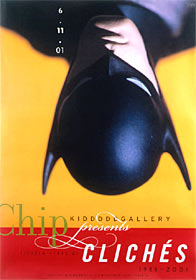
Wednesday, October 11, 2006

Image Essay # 5


I feel that this image best represents the term Broken Pattern. This image takes a lot of thought and dedication to figure out exactly where the broken pattern is because it has more than one and they’re not all so obvious.
Now I know that right off the bat just about anyone can tell that there is a window missing in the last row and that is where the broken pattern lies and that’s true but that’s not the only place where there is a broken pattern. You need to look at every window very closely in order to pick out every detail and to really notice where the broken pattern becomes extremely complicated.
Look very closely at each window and notice how every little glass pane has a little white sticker on it. Pay very close attention to the size and shape of each sticker because they play a key role in trying to figure out the pattern and they really do complicate things but they also make life interesting.
Notice the bottom-middle pane of each window. The sticker is located in exactly the same spot but are they all exactly the same size in all of them. The same goes for the bottom-left pane. Now I could go on and point out every broken pattern or pattern that there is but I don’t want to spoil all of the surprises that are in store for you!

Image Essay # 4

The symbolic color that I have chosen is turquoise. This particular color can mean so much in different civilizations and cultures. It even takes on more of a meaning when it’s inside of a stone.
In general terms turquoise is a symbol of the blue of the sea and the sky. Infinity in the sky speaks of the limitless heights of ascension. The stone is opaque as the earth, yet it lifts the spirit high, laying bare to us the wisdom of both the earth and the sky. When worn in a ring, it is believed to assure a safe journey; worn in the ear it prevents reincarnation as a donkey; appearing in a dream, it is auspicious; when found, it brings the best of luck and gives new life (in contrast, it is not considered lucky to find gold or coral); when changing its color to green, it indicates hepatitis, yet at the same time it draws out jaundice. Most importantly it is believed to absorb sin. Strings of prayer beads too include turquoise. In fact, when worshipping the popular goddess Tara in her green form, because of the color association, it is desirable to do so with a rosary entirely composed of turquoise beads. There also exists as well the concept of living and dead turquoise. Living turquoise has a healthy blue color, whereas dead turquoise has turned either white or black. In the natural aging process of turquoise, exposure to light and body oils darkens the color, eventually turning it black. Tibetans compare this to human aging and death. Wearing "living" turquoise is therefore very desirable, as it will give long life to the wearer.
Turquoise has also been held as a sacred stone by ancient cultures other than the Tibetan. It was sacred in Egypt along with malachite and lapis lazuli. It was also sacred to the Persian culture, where it symbolized purity. American Indians believe it to be a protector and guardian of the body and soul. Gypsies wear this stone in their navels, believing it to be good for everything.

Image Essay # 3


I think that this image represents the monochromatic color system very exquisitely. Just by looking at it you can tell what I’m talking about. The multiple variations of the hues are depicted quite nicely.
First off the most obvious one is the different variations of blue. You can see that light blue, medium blue and dark blue are all represented here. Not only that but notice how one variation blends so nicely into the next one almost like it’s all one color but yet you can obviously see the different variations of the hue.
There is also another very different type of variation occurring that goes along with this theme. That variation involves the color yellow. It starts out as a dark yellow and then works its way up to a medium yellow, this is where things start to get interesting, because from here the yellow gets so bright that it almost looks like pure white but there is a hint of yellow still in it.
Now there is a very diminutive differentiation between the variations of red. This time it doesn’t really show a medium variation but it does however represent the blending of dark red to bright red quite nicely.

Image Essay # 2


This artwork portrays the chromatic value vocabulary word. Well it’s obvious that this painting has a massive amount of value in it to begin with. Every color that is represented in this painting has value to it, some more than others.
Well as you can tell the dark purple or blue in the background would have a higher chromatic value then let’s say the pear that is back there with it. The pear is very dense which really takes away from its value. This in turn doesn’t really make it stand out from the rest of the composition much like the cloth that is wrapped around it. The cloth is definitely trying to show its dominance in every aspect. It’s dominant in size of course but also in value. There’s nothing else that really stands out in high value and the low values don’t differentiate enough. Take for example the apples and the pepper. They’re both done in bright colors and their brightness doesn’t really vary enough so you’re unable to tell which one has more than the other one. I think that it should have more white blended in with the blue or darken up the pepper so you don’t have so much similarity in the piece.

Image Essay # 1

This image can actually be seen as grouping and symmetrical. This image is actually an optical illusion and I haven’t seen too many optical illusions use Gestalt’s Principles. That is why I chose this image and why I think that it is the best to represent this principle. When using or identifying the grouping principle your brain tries to find mental patterns by forming a connection between the elements of sensory contribution.
In this image you can make the connection of grouping by several ways. One way would be by the size of the two faces. You can tell that they are exactly the same size and that they look exactly alike so therefore you can conclude that they are grouped together for a reason. This also closely relates to the symbols that we just got done creating. Our symbols needed to be symmetrical which this is and it does portray a meaning and to help with that meaning we incorporated the principles. Which by this piece we can conclude many things but I perceive it as two heads coming together to come up with one grand idea. You can also relate this to grouping by its shape. The two faces are identically proportionate with each other so therefore you can conclude that they’re grouping served a purpose. The artist wanted you to look beyond the ordinary so that you can see the extraordinary.

Blog Entry # 3

  1. Before this Blog Assignment, had you ever kept a journal, diary, or blog? Yes
  2. Before this Blog Assignment, had you ever written about art before? A few times
  3. Have you ever written for fun (poetry, fiction or non, journalistic, or research)? Often
  4. When writing, do you use a dictionary or thesaurus? Both
  5. If given a chance, would you rather discuss art verbally or through written means? Written
  6. How would you rate your overall vocabulary? Above Average
  7. How would you rate your vocabulary of art terminology? Average
  8. How would you rate your writing abilities? Confident
  9. How would you rate your writing abilities when writing about art? Average
  10. How would you rate your ability to use specific vocabulary when writing? Average

Wednesday, September 06, 2006

Blog Entry #2

My juxtapose images relate to each other because they were all of the female persuasion. I chose my images based on my proposed theme. I wanted my theme to be women and the things that they need to survive or always have on them. I would say that my chosen images tell a very short story as in the fact that women carry a lot of stuff in their purses that a lot of us guys aren’t aware of. I was trying to make a statement but I’m not quite sure if it was easy to figure it out or not. My statement was that women are complex creatures and no matter what we do we will not be able to figure them out even if we wanted to.
I wanted to keep the viewer from missing the point so I kept trying to bring them back in with different angles and sizes. I wanted to show the dominance of the female face because it was truly one of God’s greatest creations and by far my most favorite one. The textures are so pure and well defined. I wanted to show the Actual Texture of the face and how much balance it brought to the composition.

Monday, August 28, 2006

Blog Entry #1

My name is Josh Swint. I'm 21 years old and I'll be turning 22 in October. I have acquired and Associates Degree in Digital Media and Technology at Terra State Community College. My major was 3-D Animation. I'm currently am going for my Bachelor of Fine Arts Degree at Bowling Green State University. My current major is Graphic Design.
My dream is to have a career in Video Game Design and Producing. I have wanted to make video games ever since I was little and got my Atari 2600 for Christmas one year. I already have an idea for a video game that I would like to create. I’m naming it “When Worlds Collide.” It’s going to be a combination of like Grand Theft Auto, WWE Smackdown vs. Raw, Def Jam: Fight for New York, True Crimes and Need for Speed. I just hope that I have the pleasure an honor to make my game and future games for that matter.
I will admit that I’m not the greatest free hand artist but I can do pretty good work on the computer. I already have a few projects under my belt and I hope that as I progress in this institute and any other institute that I may attend they will help me succeed in life and in my career.
I believe that I’m a very creative person but sometimes I have a hard time bringing it out and showing it. I think it maybe because I doubt my abilities a little bit or just because I doubt myself but I’m trying to work on that.
I know that I will have a hard time in this class just because I have a hard time grasping some of the artistic concepts but I will eventually get them and I will grow from them.